Formed from a 1990 merger between the University of Detroit (1877) and Mercy College of Detroit (1941)
official hood lining pattern
The University of Detroit was a Jesuit school, so red and white were adopted in 1897 because these were the colors of the family of St. Ignatius of Loyola. Detroit assigned meanings to the two colors, with red symbolizing “the pulsing, throbbing flush of the heart’s awakening” and white symbolizing “the clear, bright light of the intellectual unfolding”, according to Our College Colors (1949) by Henry L Snyder.
Mercy College of Detroit adopted blue and white school colors when the college was founded in 1941 as these are colors associated with the Virgin Mary. When these two schools merged in 1990, red, white, and blue were carried over from each school to become the new colors of the University of Detroit Mercy.
Citations in the World Almanac (listed by cover date; color information is from the previous year): University of Detroit: red/white (1914-1935); Mercy College of Detroit: (not listed)
A photograph from a c.1905 Cotrell & Leonard catalogue that has been altered to illustrate a bachelor's hood lined with two colors divided per cross. The hood lining of the University of Detroit Mercy would display three colors, as shown above.
red
white
blue
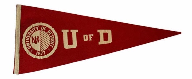
A felt pennant for the University of Detroit from the 1940s.
The chevron was by far the most common heraldic division the Intercollegiate Bureau of Academic Costume (IBAC) employed to divide the two or three colors in an institution’s hood, but Bureau president Gardner Cotrell Leonard also used other heraldic devices to avoid assigning duplicate hood linings to colleges and universities that used the same school colors. Beginning in 1895, one of the other heraldic divisions the IBAC used was what they called “[color] and [color]”, most likely referring to a “parti per pale” division whereby the two colors were divided vertically in the lining of the hood with the description being understood as “[left side] and [right side]” of the hood lining.
The University of Detroit was assigned a hood lining with a per pale division of its colors no later than 1927, according to an IBAC list from that period that described the hood lining as “bright red and white”. A 1948 IBAC list slightly revised the description to “red and white”. This would appear to have been an attempt by the IBAC to assign Detroit a hood lining that resembled the heraldry of the university’s seal, which was divided per pale. However, the IBAC reversed the position of the seal’s colors, which were white (L) and red (R).
By the late 1940s or 1950s the IBAC apparently reassigned Detroit a new hood lining pattern, possibly because the earlier description was misunderstood. A list compiled by Kevin Sheard in Academic Heraldry in America (1962) described the university’s hood lining as cardinal above white, divided per chevron, which was also how it was described in IBAC lists from 1969 (“cardinal above white, per chevron”) and 1972 (“red over white”). These late descriptions by the Bureau were probably copied from Sheard.
The same 1972 IBAC list described the hood lining of Mercy College of Detroit as white with a “Malta blue” chevron. “Malta blue” probably referred to the famous azure blue color of the water around the island of Malta.
The Intercollegiate Bureau was largely defunct by 1990, so it never assigned a hood lining pattern to the University of Detroit Mercy.
Here a hood lining has been designed to resemble the seal of the university, which is divided per pale, white (left) and blue (right) – itself an homage to the heraldic pattern of the old seal of the University of Detroit. To incorporate the University of Detroit Mercy’s third color of red, the Intercollegiate Bureau’s original red and white lining pattern for the University of Detroit has been retained above the white and blue.