Walsh University
Ohio
1960


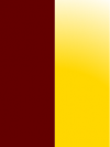
The official colors of Walsh College were initially crimson and gold, but by the 1980s some college documents were describing the colors as maroon and gold. These two definitions of the school colors were used interchangeably into the 1990s after Walsh became a university in 1993. Today the colors are officially cited as maroon and gold, but the shade of Walsh’s “maroon” (Pantone 202) lacks the brown tint normally associated with maroon and is actually a dark red (or dark crimson) color similar to garnet. Apparently, Walsh has always used dark red and gold as their school colors, but has described the dark red color using two different synonyms, neither one being a completely accurate description of the actual shade of dark red.


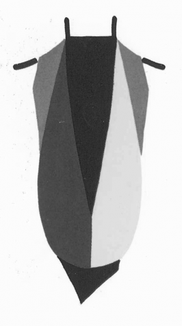
The IBAC assigned Walsh University a hood lining not long after it was founded in 1960. A list compiled by Kevin Sheard in Academic Dress and Insignia of the World (1970) described Walsh’s hood lining as crimson and gold divided “per pale” (a vertical division of the colors), with crimson on the left and gold on the right.
Strangely, a 1972 IBAC list described Walsh’s hood lining as “crimson over gold”, which usually indicated a division of the colors per chevron, per reversed chevron, or per bar. This was probably an erroneous description, as it would have created a potential duplication with either Seton Hill College (assigned crimson over gold; but actually scarlet over gold) or Concordia College (maroon over gold).
Here the heraldic arrangement of Walsh’s hood from 1970 has been used with the university’s actual colors of dark red and gold (what Walsh calls “maroon” and gold).