Wheaton College
Illinois
1860


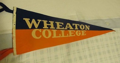
In 1890, the president of Wheaton College, Charles A. Blanchard, selected orange and blue as the colors of the college because he was fond of the colors of the Dutch flag. One historical source states that Wheaton’s orange and blue were intended to symbolize the chivalry of the Christian knights of the Middle Ages, but did not elaborate how these colors are connected to that ideal. The shade of Wheaton’s blue was dark, like navy blue.


Citations in the World Almanac (listed by cover date; color information is from the previous year): orange/blue (1911-1935)
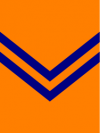
The chevron was by far the most common heraldic division the Intercollegiate Bureau of Academic Costume (IBAC) employed to divide the two or three colors in an institution’s hood, but beginning in 1895 the “double chevron” was also used quite frequently. The typical width of a normal chevron was between four and five inches, but the double chevron pattern used two chevrons of about 1½ to two inches in width placed approximately one inch apart so that the color of the hood lining showed between them.
To avoid duplicating the hoods already assigned to Lincoln University in Pennsylvania, Gettysburg College, and the University of Florida (at that time, all orange with a navy blue chevron) the Intercollegiate Bureau assigned Wheaton College a hood lining that was orange with two Yale blue chevrons no later than 1927, according to a Bureau list from that period. Identical descriptions appeared in IBAC lists from 1948 and 1972. “Yale blue” was how the Bureau typically described a dark shade of blue like navy blue. A list compiled by Kevin Sheard in Academic Heraldry in America (1962) described Wheaton’s hood lining as “deep orange” (dark orange) with two dark blue chevrons, but this was an inaccurate description of the college’s shade of orange.